


Landing pages are an incredibly valuable tool for any business—whether you’re marketing a physical product or just promoting something like an e-book, there’s nothing like a clean and compelling landing page to convince visitors to become customers.
Today, I’ll show you how to create an effective landing page from scratch using the popular Bootstrap framework, which you can use as a template for your own web pages (or modify and sell to others). Let’s get started!
What is Bootstrap?
In case you don’t know, Bootstrap is an open-source front-end web design framework created by Twitter in 2011. It’s basically a CSS and JavaScript toolkit for designing websites and web applications. The great thing about it is that it enables faster development of static pages using prebuilt components, which is why I use it on my own website when I don’t have time to code something completely new.
Which is most of the time.
It’s a free tool, so it’s definitely worth giving it a try. That said, you should be aware that there are other similar tools such as Tailwind, Skeleton, Foundation, etc. I have not tried all of them, but I recommend using Bootstrap because it’s extremely flexible, fast and easy to use. Also, it has an active community behind it with plenty of available resources if you run into any issues.
The Layout
Before we go further, I’d like to note that this article assumes you have existing knowledge of HTML fundamentals, CSS, and at least basic Bootstrap. Is it possible to build a landing page without this knowledge? Sure. You’ll have to do like it’s IKEA: assemble the code even though you don’t fully understand what every line does.
The first thing to do is to plan your layout. A basic landing page contains
- A fixed responsive navbar
- A hero section
- A services section(ideally 3 columns)
- A “contact us” section
- A footer section Now let's get into the code
Getting started
First, we have to set up Bootstrap in the HTML file. There are a couple of ways to set up Bootstrap, you could download the entire thing to your computer and link it in the same way you link a CSS file, by putting it in the same folder and calling out its path with a link tag, Or you could download the compiled CSS and JavaScript and add it to your HTML page as code.
There’s nothing wrong with the former, but I’m lazy so I always go with the latter.
We will be using the latter in this example. First, Put the minified CSS file at the top of your HTML page and the JavaScript file at the bottom. Since all Bootstrap plugins rely on jQuery, it's necessary to also include jQuery before the minified Bootstrap script. Basically, just do the following
<!doctype html>
<html lang="en">
  <head>
    <!-- Required meta tags -->
    <meta charset="utf-8">
    <meta name="viewport" content="width=device-width, initial-scale=1, shrink-to-fit=no">

    <!-- Bootstrap CSS -->
    <link rel="stylesheet" href="https://cdn.jsdelivr.net/npm/bootstrap@4.5.3/dist/css/bootstrap.min.css" integrity="sha384-TX8t27EcRE3e/ihU7zmQxVncDAy5uIKz4rEkgIXeMed4M0jlfIDPvg6uqKI2xXr2" crossorigin="anonymous">

    <title>document</title>
  </head>
  <body>
    <h1>Hello, world!</h1>

    <!-- Optional JavaScript; choose one of the two! -->

    <!-- Option 1: jQuery and Bootstrap Bundle (includes Popper) -->
    <script src="https://code.jquery.com/jquery-3.5.1.slim.min.js" integrity="sha384-DfXdz2htPH0lsSSs5nCTpuj/zy4C+OGpamoFVy38MVBnE+IbbVYUew+OrCXaRkfj" crossorigin="anonymous"></script>
    <script src="https://cdn.jsdelivr.net/npm/bootstrap@4.5.3/dist/js/bootstrap.bundle.min.js" integrity="sha384-ho+j7jyWK8fNQe+A12Hb8AhRq26LrZ/JpcUGGOn+Y7RsweNrtN/tE3MoK7ZeZDyx" crossorigin="anonymous"></script>
  </body>
</html>
Next, let's look at the Navbar
The Navbar
Bootstrap comes with a predesigned utility navbar that you can easily edit however you want. You can add a Bootstrap Navbar with the following code
<nav class="navbar navbar-expand-lg navbar-light bg-light">
  <a class="navbar-brand" href="#">Navbar</a>
  <button class="navbar-toggler" type="button" data-toggle="collapse" data-target="#navbarNavDropdown" aria-controls="navbarNavDropdown" aria-expanded="false" aria-label="Toggle navigation">
    <span class="navbar-toggler-icon"></span>
  </button>
  <div class="collapse navbar-collapse" id="navbarNavDropdown">
    <ul class="navbar-nav">
      <li class="nav-item active">
        <a class="nav-link" href="#">Home <span class="sr-only">(current)</span></a>
      </li>
      <li class="nav-item">
        <a class="nav-link" href="#">Features</a>
      </li>
      <li class="nav-item">
        <a class="nav-link" href="#">Pricing</a>
      </li>
      <li class="nav-item dropdown">
        <a class="nav-link dropdown-toggle" href="#" id="navbarDropdownMenuLink" role="button" data-toggle="dropdown" aria-haspopup="true" aria-expanded="false">
          Dropdown link
        </a>
        <div class="dropdown-menu" aria-labelledby="navbarDropdownMenuLink">
          <a class="dropdown-item" href="#">Action</a>
          <a class="dropdown-item" href="#">Another action</a>
          <a class="dropdown-item" href="#">Something else here</a>
        </div>
      </li>
    </ul>
  </div>
</nav>
The above code results in this
 By default, the background color of Bootstrap Navbars are white, but you can change the colors to red, green, purple, blue, etc. All you have to do is change the bg-white code to something else. For instance, the following code
<nav class="navbar navbar-dark bg-dark">
  <!-- Navbar content -->
</nav>

<nav class="navbar navbar-dark bg-primary">
  <!-- Navbar content -->
</nav>

<nav class="navbar navbar-light" style="background-color: #e3f2fd;">
  <!-- Navbar content -->
</nav>
Directly results in this
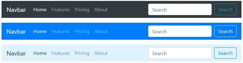 The search section can be added with this, but most times it’s not needed.
<form class="form-inline">
    <input class="form-control mr-sm-2" type="search" placeholder="Search" aria-label="Search">
    <button class="btn btn-outline-success my-2 my-sm-0" type="submit">Search</button>
  </form>
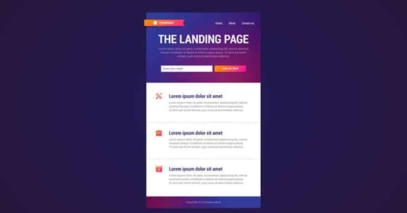
Next, let’s move on to the hero section.
The Hero section
The hero section is one of the most important parts of a landing page. It’s what the customer sees first. They typically consist of a full-width background image, a headline, a brief description, and a call-to-action button. To design this section, we’ll use Jumbotron. Jumbotron is a pre-designed component that allows you to effortlessly add a hero section to your page. You must apply the .jumbotron class to the element that will contain the hero section with the following code
<div class="jumbotron jumbotron-fluid">
<div class=”container-fluid”>
  <h1 class="display-4">Hello, world!</h1>
  <p class="lead">This is a simple hero unit, a simple jumbotron-style component for calling extra attention to featured content or information.</p>
  <hr class="my-4">
  <p>It uses utility classes for typography and spacing to space content out within the larger container.</p>
  <p class="lead">
    <a class="btn btn-primary btn-lg" href="#" role="button">Learn more</a>
  </p>
</div>
</div>
You can use the .container-fluid and .jumbotron-fluid classes to create a full-width hero section. Use .container and .jumbotron instead if you don't want it to span the entire viewport. Or just check the jumbotron docs itself for a better explanation
Note that the text in the code above is just dummy text, if you want to get real text that’d drive your business forward, hire a copywriter. Trust me, you need one.
The Services section
This section is a bit more complicated. You have to have a solid knowledge of flexbox, grids, and media queries to be able to code this part from scratch. While I assume you have a working knowledge of all these, it can still be a bother writing the code from scratch.
Luckily, The service section can be easily done with Bootstrap, using cards. Bootstrap cards allow us to add headers and footers, a wide variety of content, contextual background colors, and powerful display options. You can add Bootstrap cards with the following code
<div class="card-deck">
  <div class="card">
    <img src="..." class="card-img-top" alt="...">
    <div class="card-body">
      <h5 class="card-title">Card title</h5>
      <p class="card-text">This is a wider card with supporting text below as a natural lead-in to additional content. This content is a little bit longer.</p>
    </div>
    <div class="card-footer">
      <small class="text-muted">Last updated 3 mins ago</small>
    </div>
  </div>
  <div class="card">
    <img src="..." class="card-img-top" alt="...">
    <div class="card-body">
      <h5 class="card-title">Card title</h5>
      <p class="card-text">This card has supporting text below as a natural lead-in to additional content.</p>
    </div>
    <div class="card-footer">
      <small class="text-muted">Last updated 3 mins ago</small>
    </div>
  </div>
  <div class="card">
    <img src="..." class="card-img-top" alt="...">
    <div class="card-body">
      <h5 class="card-title">Card title</h5>
      <p class="card-text">This is a wider card with supporting text below as a natural lead-in to additional content. This card has even longer content than the first to show that equal height action.</p>
    </div>
    <div class="card-footer">
      <small class="text-muted">Last updated 3 mins ago</small>
    </div>
  </div>
</div>
Here’s what that would look like
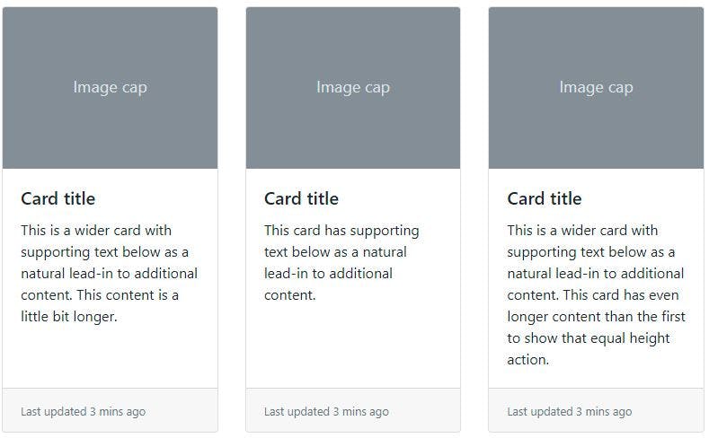 You can edit out what you don't like, like the card footer, and put in what you want. I personally leave it there because even though it doesn't serve any real purpose, it looks nice.
The Contact Us section
This is by far the easiest part of a landing page. There are two ways of dding a contact us section. You could add text and a button that could take you to a different page, like this
<section class="container-fluid text-center py-4 mt-4" id="contact">
   <h2 class="display-4 pb-4 my-4">Get in touch with us today!</h2>
   <p class="lead pb-3">Send us a message and we will get back to
   you as soon as possible.</p>
   <a href="#" class="btn btn-primary btn-lg mb-4" role="button">Contact us</a>
</section>
Or, you could just add in the form directly on the page, like this
<section>
      <div class="container-fluid mb-5">
        <div class=" container mb-5  py-5 pl-lg-5">

          <h2>
            Contact Us
          </h2>

          <form >
            <div class="contact-form">
              <div class="row mb-3">
                <div class="col control-group">
                  <input type="text" class="form-control p-4" id="First name" placeholder="First name">
                </div>
                <div class="col control-group">
                  <input type="text" class="form-control p-4" id="Last name" placeholder="Last name">
                </div>
              </div>
              <div class="control-group">
                <input type="email" class="form-control p-4" id="email" placeholder="Your Email" required="required" data-validation-required-message="Please enter your email" />
                    <p class="help-block text-danger"></p>
              </div>
              <div class="control-group">
                  <input type="text" class="form-control p-4" id="subject" placeholder="Subject" required="required" data-validation-required-message="Please enter a subject" />
                  <p class="help-block text-danger"></p>
              </div>
              <div class="control-group">
                  <textarea class="form-control p-4" rows="6" id="message" placeholder="Message" required="required" data-validation-required-message="Please enter your message"></textarea>
                  <p class="help-block text-danger"></p>
              </div>
              <div>
                  <button class="btn btn-primary py-3 px-5" type="submit" id="sendMessageButton">Send Message</button>
              </div>
            </div>


          </form>
        </div>
      </div>
    </section>
Either way is good honestly, It all depends on the specifications of the landing page. Personally, I prefer the latter because…lazy. Plus, if you use the former, you'll still need to create a form in the contact us page.
The Footer
Footers are usually pretty simple, all you have to do is put in the following code
<footer class="py-3 bg-light">
<div class="container">
<p class="text-center">Copyright © Fimber 2022</p>
</div>
</footer>
That’s about it.
Conclusion
We’ve succeeded in creating the skeleton of a rather simple landing page in this tutorial. Other sections, such as major features, pricing tables, client logos, and testimonials, would be included in the real world. You may simply design other column-based sections, similar to the Services section, using Bootstrap 4's responsive grid framework.
If you want to see what a live website made with bootstrap looks like, visit GlamAlley. It’s not much, but it’s honest work. I hope this becomes your cheatsheet anytime you want to create a landing page. Got any suggestions or comments? Drop them below in the comment section. Till next time, live a life of purpose