There are many different ways to present user input in iOS applications, and the most important of them is probably the form. Creating forms in SwiftUI can seem like an impossible task at first, especially if you’re not familiar with the library.
We’ve been able to put together a step-by-step guide, complete with diagrams. Whether you want to build a form from scratch or use one of the examples below as a reference, you can find exactly what you need here!
In this article, I’ll be creating a settings screen form from scratch in a few simple steps, complete with text fields, toggles, steppers, pickers, and a few extras. Without wasting any more time, let’s dive right into it.
Creating the form
Add a TextField
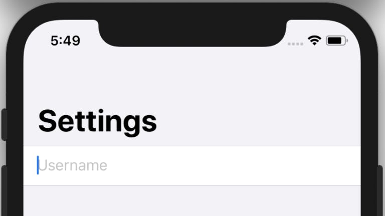
First, we'll create a basic form with TextField. If you don’t know what that is, a text field is a single-line, fixed-height field that, when tapped, displays a keyboard. It allows you to request a little bit of information, such as a name or an email address, using a text box. To add a text field to your form, you’ll have to wrap your content view in NavigationView and then embed a Form within it.
struct ContentView: View {
    @State var username: String = ""

    var body: some View {
        NavigationView {
            Form {
                TextField("Username", text: $username)
            }
            .navigationBarTitle("Settings")
        }
    }
}
The above code will result in this
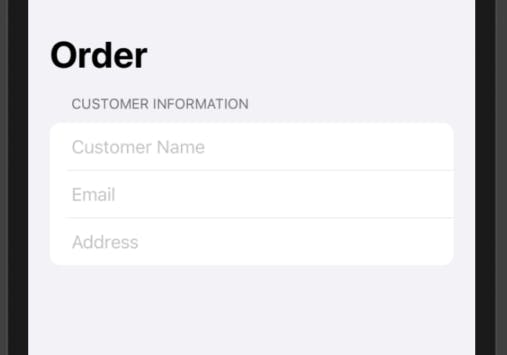
Text fields can be used in different ways. For instance, if you’re creating an order form and you need to take in customer information like name, email, and address, you could use the text field to do that like this
struct ContentView: View {
  @State var name: String = ""
   @State var address: String = ""
   @State var email: String = ""
   var body: some View {
       NavigationView {
           Form {
               Section(header: Text("Customer Information")) {
                   TextField("Customer Name", text: $name)
                   TextField("Email", text: $email)
                   TextField("Address", text: $address)
               }
           }.navigationBarTitle("Order")
       }
   }
}
The result of this code will look like this
 Note that just like in our previous example, we used the
 State variable to hold the value of the text input in the text field. It’s essential that you don’t miss this step.
Add a Toggles a Section
Next, we’ll need to add a toggle that allows you to make an account private. To do this, we’ll create a section called “Profile”, and wrap both the text field and toggle in it.
We’ll also be using the section tag heavily moving forward. The section tag allows you to divide the Form into different sections and you can provide each section with a header and footer. The header and footer accept a View, so you can place any custom view or a simple Text view as seen above.
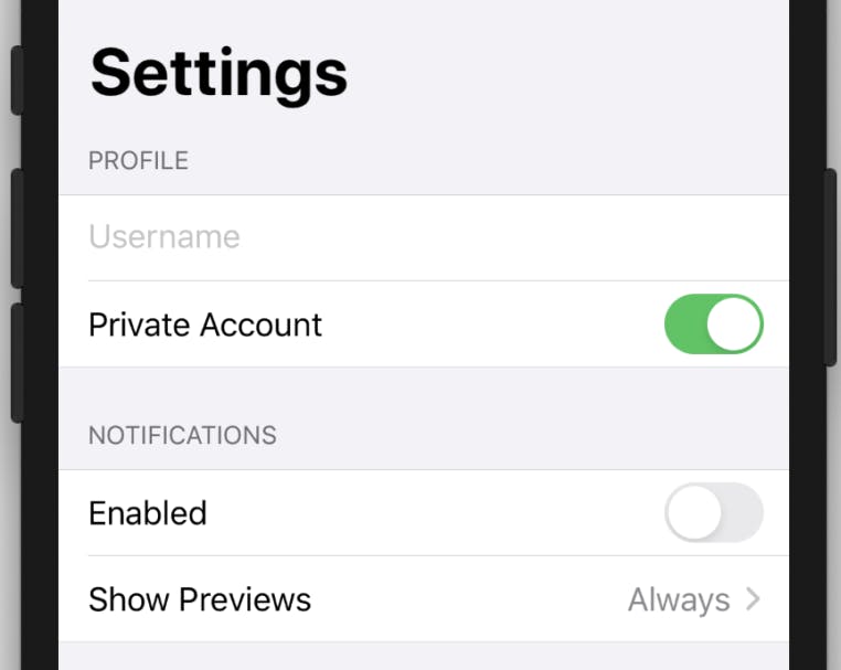
Then we'll add a notification section which will also contain a toggle to switch notifications on and off, and a picker to select notification options. You can create as many notification options as you like, but for this example, we'll be creating three notification options("Always", "When Unlocked", and "Never").
This can be done with the following code
@State var username: String = ""
@State var isPrivate: Bool = true
@State var notificationsEnabled: Bool = false
    @State private var previewIndex = 0
    var previewOptions = ["Always", "When Unlocked", "Never”]

var body: some View {
    NavigationView {
        Form {
            Section(header: Text("PROFILE")) {
                TextField("Username", text: $username)
                Toggle(isOn: $isPrivate) {
                    Text("Private Account")
                }
            }
        }

Section(header: Text("NOTIFICATIONS")) {
    Toggle(isOn: $notificationsEnabled) {
        Text("Enabled")
    }
    Picker(selection: $previewIndex, label: Text("Show Previews")) {
        ForEach(0 ..< previewOptions.count) {
            Text(self.
        .navigationBarTitle("Settings")
    }
}
As you can see, we’ve also initialized a couple of variables at the top of the code. Be sure to pay attention to those when creating your form as they’re vital to the entire thing.
The result of the above code will look like this
Add an about section and button
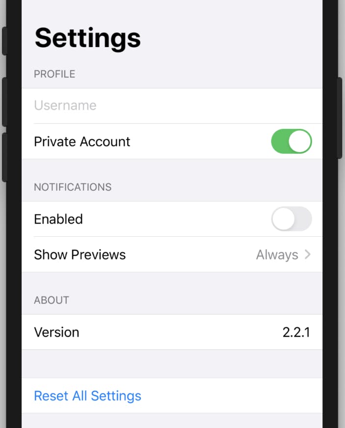
Finally, we'll add another section to tell us the version info, and add a button at the end that'll allow us to reset all the values in the form into their default settings.
Section(header: Text("ABOUT")) {
                    HStack {
                        Text("Version")
                        Spacer()
                        Text("2.2.1")
                    }
                }

                Section {
                    Button(action: {
                        print("Perform an action here...")
                    }) {
                        Text("Reset All Settings")
                    }
                }
            }
            .navigationBarTitle("Settings")
There you have it!. Here's the complete code for the form if you just feel like copying the whole thing.
struct ContentView: View {
    @State var username: String = ""
    @State var isPrivate: Bool = true
    @State var notificationsEnabled: Bool = false
    @State private var previewIndex = 0
    var previewOptions = ["Always", "When Unlocked", "Never”]

    var body: some View {
        NavigationView {
            Form {
                Section(header: Text("PROFILE")) {
                    TextField("Username", text: $username)
                    Toggle(isOn: $isPrivate) {
                        Text("Private Account")
                    }
                }

                Section(header: Text("NOTIFICATIONS")) {
                    Toggle(isOn: $notificationsEnabled) {
                        Text("Enabled")
                    }
                    Picker(selection: $previewIndex, label: Text("Show Previews")) {
                        ForEach(0 ..< previewOptions.count) {
                            Text(self.previewOptions[$0])
                        }
                    }
                }

                Section(header: Text("ABOUT")) {
                    HStack {
                        Text("Version")
                        Spacer()
                        Text("2.2.1")
                    }
                }

                Section {
                    Button(action: {
                        print("Perform an action here...")
                    }) {
                        Text("Reset All Settings")
                    }
                }
            }
            .navigationBarTitle("Settings")
        }
    }
}
Bonus: Steppers and Sliders
While steppers and sliders are not included in the original form we did, they're an integral part of SwiftUI forms and this article would be incomplete without them.
A stepper is a user interface control that allows you to increase or decrease a value by tapping on its plus or minus elements. To create a stepper, you have to define a State variable holding the stepper’s value and then pass its binding when initializing the stepper. This can be done with the following code
struct ContentView: View {
    @State var stepperValue: Int = 0

    var body: some View {
        VStack {
            Stepper("Stepper value: \(stepperValue)", value: $stepperValue)
        }.padding()
}
The result of the above will look like this
 Steppers can be restricted to a certain range. For instance, if you want to build a stepper for let's say an age range of 18 to 25, you can do that with the following code
Stepper("Stepper value: \(stepperValue)", value: $stepperValue, in: 18...25)
Next, Let’s look at sliders.
A Slider is a user interface control that allows you to choose a value from a specified linear range of values by using touch. It’s an integral part of forms and UI as a whole.
Creating a slider is simple. First, you need to define a State variable called sliderValue which is being used by the slider to store the slider’s current value. Next, initialize the slider by passing a binding to sliderValue and specified a range of possible values of the slider. Finally, add a text view to display the slider’s current value, rounded to two decimal places.
struct ContentView: View {
    @State var sliderValue: Double = 0

    var body: some View {
        VStack {
            Slider(value: $sliderValue, in: 0...20)
            Text("Current slider value: \(sliderValue, specifier: "%.2f")")
        }.padding()
    }
}
The result of the above code will be this

The best thing about sliders is the flexibility it gives you. You can play around with the slider by adding borders, changing the colors, etc into anything you want, and it's pretty easy to do that too. For instance, If I want to change the above slider color to green, and add a border, I’ll simply do this
Slider(value: $sliderValue, in: 0...20, step: 1)
    .padding()
    .accentColor(Color.green)
    .border(Color.green, width: 2)
And I’ll get this

Pretty cool yeah?
Conclusion
If you made it all the way here, Congratulations!!! You’re amazing, and you’ve learned how to create a form from scratch using SwiftUI. Compared to the old legacy approach of UIKit, where developers had to leverage table views or collection views with a lot of boilerplate code, this is a piece of cake! If you want to learn more, you could look at Apple’s official docs. I hope this article helps you grow and becomes your cheat sheet for building forms with SwiftUI.
See you in the next one.
