Photo by Jackson Sophat on Unsplash
When and how to choose between media queries and container queries
Everyone who keeps up with the latest events in the world of responsive design will agree that the introduction of CSS container queries is a game changer. It’s the most exciting thing that has happened since the introduction of, well, media queries.
But what is a container query? Why are container queries important and how can you use them?
In this article, we’re going to answer all of those questions and more through the following sections:
- What is a media query in CSS?
- The problem with media queries
- When and how to use media queries
- When and how to use container queries
Without wasting any more time, let’s get right into it.
What is a media query in CSS?
Long ago, most websites had a lot of trouble rendering components on different screen sizes, especially with the mobile phone revolution. Most websites fixed that problem by creating a new website with the domain m.. If you’ve ever used m.facebook.com, this is why.
All that was before media queries. With media queries, websites can be built to fit a particular viewport, so gone are the days of zooming in on your smartphone to see what’s on the website.
Media queries provide a conditional statement around some styles, which are then implemented or not based on whether the conditions are met or not.
The problem with media queries
While media queries changed a lot, they still had one problem: they’re not reusable. With media queries, you can create a responsive element and implement it, and even though it looks good in a standard use case, it probably won’t work as well if it’s moved to a different container with CSS properties that affect element dimensions. For it to work properly, you’ll need to add many more CSS properties.
Here’s where container queries come in. With container queries, you can now target individual elements themselves and enable them to adapt to virtually any given container or layout.
Container queries are like media queries; the only difference is they make a container or an element responsive based on the space available to the container, rather than the viewport. But that raises the question: Do we even need media queries anymore?
When and how to use media queries
The answer to the above question is yes! There are still a ton of use cases for media queries, despite container queries solving their considerable limitations.
Media queries can and should still be used for page layouts, which are usually at the very top level of the DOM and not nested in another container. They’re best suited for this because the main page layout should not adapt to anything other than the viewport.
Media queries can also be used to style global elements like spacing, font size, or colors. For example, if you build a website with large font sizes, chances are the font and spacing will be too large for a mobile screen. That can be fixed with media queries like this:
:root {
   --font-size-hl: 20px;
   --font-size-h2: 15px;
   --font-size-h3: 12px;
   --font-size-p: 8px;


   --letter-spacing: 8px;
}

@media (min-width: 300px) {
   :root {
       --font-size-hl: 13px;
       --font-size-h2: 10;
       --font-size-h3: 8px;
       --font-size-p: 5pxrem;
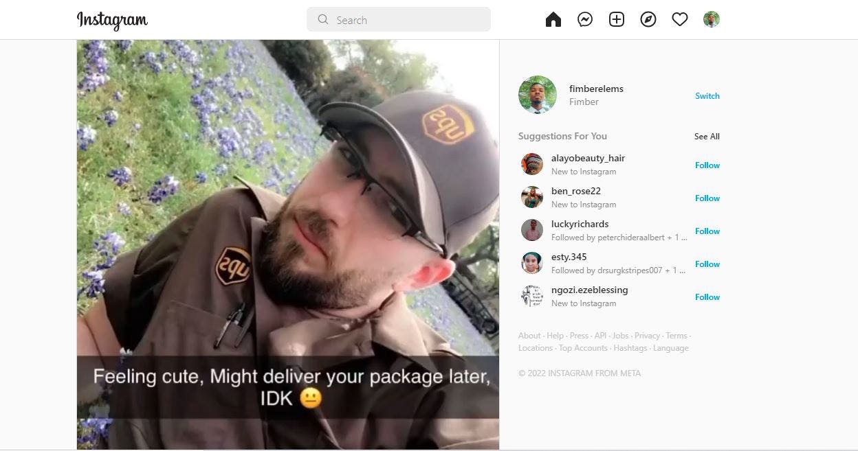
One of the scenarios media queries in which shine is when you have to remove a component from a page. For instance, look at this Instagram home page:
On desktop, the message bar looks really good, but most mobile devices do not have the screen size to display this appropriately. With media queries, the entire message tab can be removed and the same page will display like this.
It’s worth noting that media queries aren’t just for detecting screen sizes and how they affect components.
Media queries can also be used for different queries related to user preference, such as:
- prefers-reduced-motion
- prefers-contrast
- prefers-reduced-transparency
- prefers-color-scheme
- pointer accuracy
When and how to use container queries
Container queries allow you to target a specific container and configure it to display based on the width and height of the container, without having to use media queries. It’s mostly used for card components, but it’s flexible, so you can use it for multiple components.
With vanilla CSS, the properties used in container queries share a lot of similarities with the properties you’ve been using in media queries. The only other properties you need to learn are:
container-type: Used to declare the element as a query container, allowing the child component to query against itcontainer-name: Used to assign a name to the container for further filtering
Let’s take a look at a quick card example. First, let’s draft out a card with HTML.
<div class="container">
<div class="contain-container contain-container--small">
<h2>first example</h2>
<div class="contain">
<div class="contain__thumbnail"></div>
<div class="contain__content">
<h3 class="contain__title">Lorem Ipsium in english</h3>
<p class="contain__description">But I must explain to you how all this mistaken idea of denouncing pleasure and praising pain was born and I will give you a complete account of the system, and expound the actual teachings of the great explorer of the truth, the master-builder of human happiness. No one rejects, dislikes, or avoids pleasure itself, because it is pleasure, but because those who do not know how to pursue pleasure rationally encounter consequences that are extremely painful. Nor again is there anyone who loves or pursues or desires to obtain pain of itself, because it is pain, but because occasionally circumstances occur in which toil and pain can procure him some great pleasure. .</p>
</div>
</div>
</div>
<div class="contain-container contain-container--large">
<h2>Second example</h2>
<div class="contain">
<div class="contain__thumbnail"></div>
The dummy text is just a translated version of lorem ipsum. It’s my personal quirk.
Next, let’s put in the CSS.
body {
  background: #5f64e2;
  font-family: -apple-system, BlinkMacSystemFont, "Segoe UI", Roboto, Helvetica,
    Arial, sans-serif, "Apple Color Emoji", "Segoe UI Emoji", "Segoe UI Symbol";
  color: #fdf2f2;
}

.container {
  padding: 16px;
  margin: auto;
  display: flex;
  gap: 16px;
}

.contain-container {
  margin: 16px auto;
  flex-grow: 0;
  contain: layout inline-size;
  container-type: inline-size;
  --css-contain: layout inline-size;
}

.contain-container--small {
  width: 300px;
}

.contain-container--large {
  width: 600px;
}

.contain {
  padding: 16px;
  border-radius: 8px;
  background: black;
  margin-bottom: 16px;
  color: white;
}

  .contain__thumbnail {
    height: 130px;
    min-width: 130px;
    background: red;
    border-radius: 4px;
  }

  .contain__title {
    margin-top: 4px;
    margin-bottom: 8px;
  }

  .contain__description {
    margin: 0;
  }
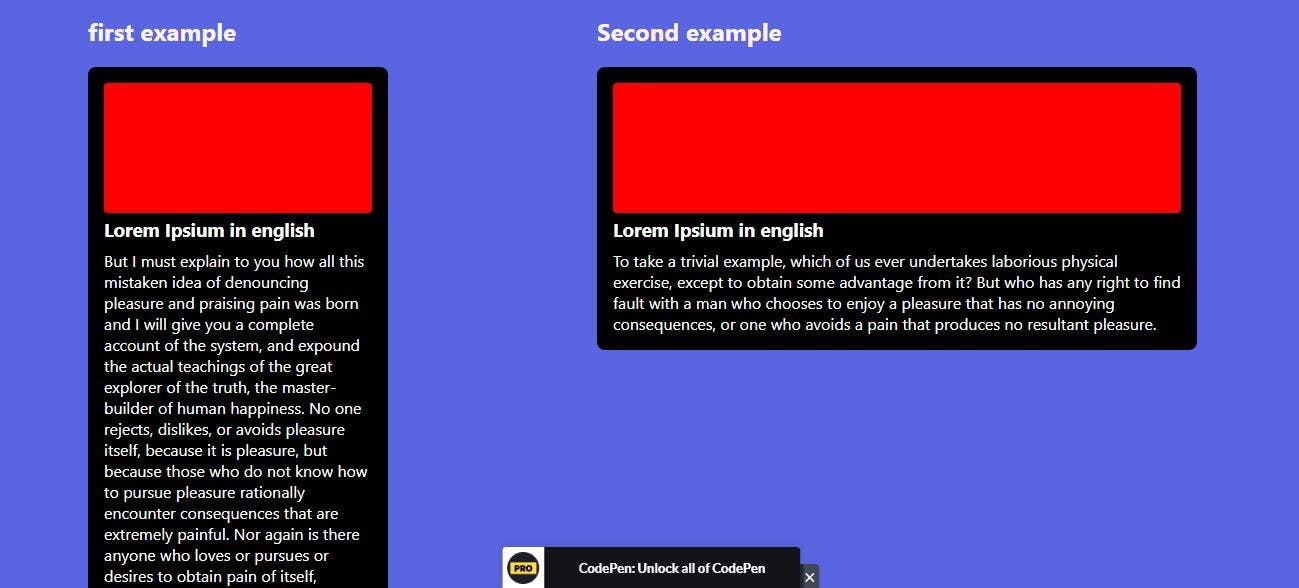
The result of the above code will look like this:
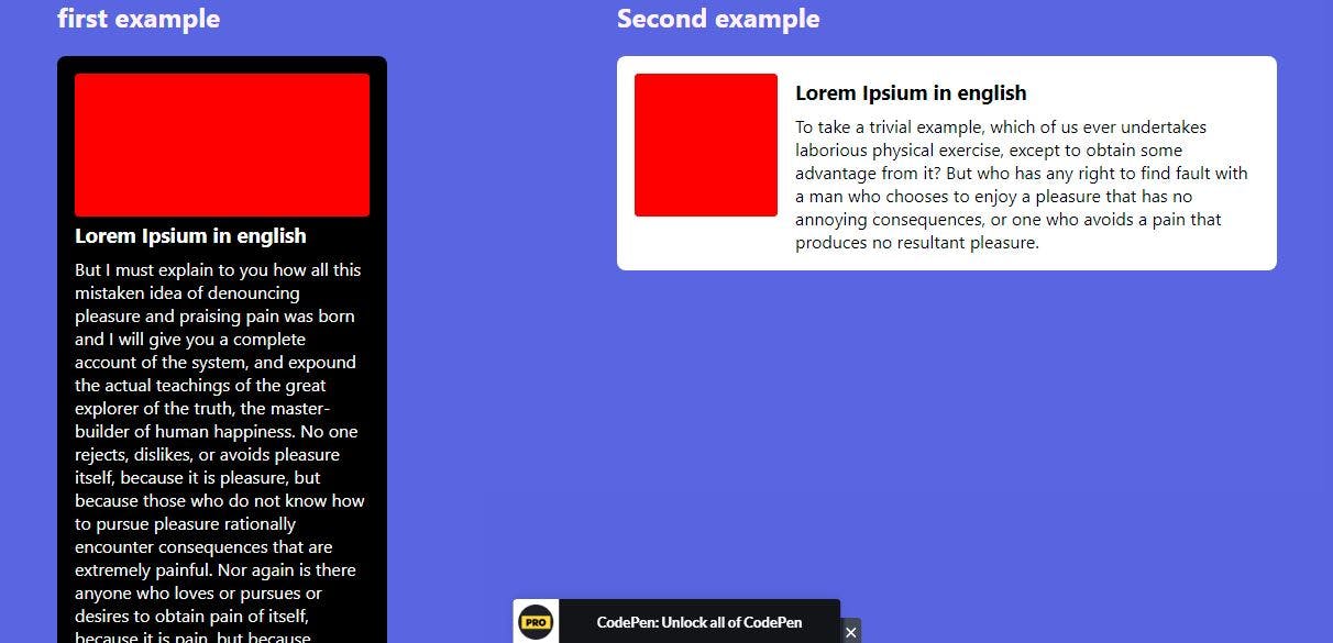
Both cards are largely the same, except that one has a width of 300px and the other has a width of 600px. With container queries, we can make the card on the right look and behave very differently with the following code.
@container (min-width: 400px) {
  .contain {
    background-color: white;
    color: black;
    display: flex;
    gap: 16px;
  }
}
What that code does is tell any container that is over 400px wide to have a background color of white, use display: flex, and have a text color of black. The result will look like this:
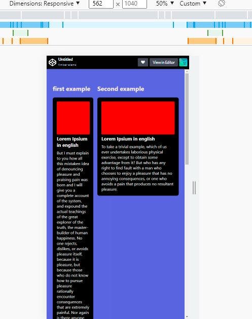
The changes to the card on the right only apply if the card has to occupy a space with a width of ≥ 400px, so if there’s not enough space for it to display, or if it’s being viewed by a mobile device, the cards will revert to this.
Container queries with CSS-in-JS
I know JSS, or CSS-in-JS, is a pretty controversial topic right now. There are a couple of people, like this guy who hates JSS and doesn’t want you anywhere near it, or this guy who absolutely loves it and wants you to use it.
Whether you like JSS or not, you’ve got to admit it’s pretty handy. Just like with normal CSS, it’s possible to use container queries in JSS. Here’s a very simple example of how it works.
First, let’s build four simple containers.
<div class=cquery>
  <h1>To take a trivial example, which of us ever undertakes laborious physical exercise, except to obtain some advantage from it? </h1>
</div>

<div class=cquery style=width:80%>
  <h1>To take a trivial example, which of us ever undertakes laborious physical exercise, except to obtain some advantage from it?</h1>
</div>

<div class=cquery style=width:60%>
  <h1>To take a trivial example, which of us ever undertakes laborious physical exercise, except to obtain some advantage from it?</h1>
</div>

<div class=cquery style=width:40%>
  <h1>To take a trivial example, which of us ever undertakes laborious physical exercise, except to obtain some advantage from it?</h1>
</div>
Next, let’s add the JSS. I’ve put some comments in to make it easily understandable.
function JSinCSS() {
  //target an html element with id ='JSinCSS' and declare it tag
  let tag = document.querySelector("#JSinCSS");

  //if there is no html element with id ='#JSinCSS'
  if (!tag) {
    //create a style tag like this
    //<style></style>
    tag = document.createElement("style");

    //set id of style tag to be 'JSinCSS'
    //<style id='JSinCSS'></style>
    tag.id = "JSinCSS";
    //we call document.head.appendChild to append the style element to the head tag as a child.
    document.head.appendChild(tag);
  }

  //inside the style tag add innerHTML to it

  tag.innerHTML = `

    body:before {
      content: '${innerWidth} x ${innerHeight}';
    }

    .cquery {
      border: 4px solid red;
      background-color: green;
    }

    ${containerQuery('.cquery', 'this.offsetWidth > 500', `

      $this {
        background: blue;
      }

      $this h1 {
        font-size: 30pt;
      }

    `)}

    ${containerQuery('.cquery', 'this.offsetWidth > 800', `

      $this {
        background: purple;
      }

      $this h1 {
        font-size: 30pt;
      }

    `)}


    ${containerQuery('.cquery', 'this.offsetWidth > 1000', `

      $this {
        background: gold;
      }

      $this h1 {
        font-size: 30pt;
      }

    `)}

  `

}

function containerQuery(selector, test, stylesheet) {
    //target the container element and declare it tag
  var tag = document.querySelectorAll(selector);
  var style = "";
  var count = 1;

  for (var i = 0; i < tag.length; i++) {
      //tag.length return the number of nodes in tag
      // run a forLoop so when i == tag.length
      //declare a function that returns test
    var func = new Function(`return ${test}`);
    var attr = (selector + test).replace(/[= "'><+\.]/g, "");

    if (func.call(tag[i])) {
      tag[i].setAttribute(`data-${attr}`, count);

      var css = stylesheet.replace(/\$this/g, `[data-${attr}="${count}"]`);

      style += css;

      count++;
    } else {
      tag[i].setAttribute(`data-${attr}`, "");
    }
  }

  return style;
}

//call the function in to listen to different events and call the function JSinCSS
window.addEventListener("load", JSinCSS);
window.addEventListener("resize", JSinCSS);
window.addEventListener("input", JSinCSS);
window.addEventListener("click", JSinCSS);
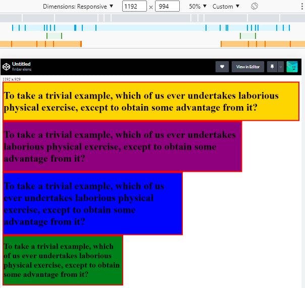
The code above creates four different containers and then sets a container query with the containerQuery tag so that the colors of the containers change at different sizes. The result looks like this.
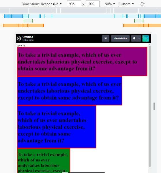
From the HTML, you can see it’s the same container. But at a width of ≥1000px, the container color becomes gold. At widths of 800px and 500px, the container becomes purple and blue, respectively. Below that, it stays in its default green color. So, if these same containers have to occupy a space that’s ≤1000px, you’ll get this:
Conclusion
The entire point of responsive design is achieving versatility and efficiency, and with the introduction of container queries, we’re one step closer to perfection in responsive design. It solves a lot of the limitations of media queries, but it doesn’t entirely replace media queries.
I personally think media queries and container queries are like chicken nuggets and hot sauce: they both have their uses separately, but together, they’ll rock your world. I hope you have fun using them.
See you in the next one.

